heRo3 Threshold Analysis
Data Visualization & Modeling UI
Skills Used
Figma | Data Visualization | R-Models | React
Health economists needed a way to find the exact tipping points in their models—where one intervention becomes more cost-effective than another. I designed a visual threshold analysis tool using bespoke gauges and convergence graphs. This allowed data scientists to build complex formulas step-by-step and instantly visualize the exact values that produced their desired outcomes.
1. The Core Problem: Finding the Tipping Point
In health economics, finding the “threshold” is critical. Analysts needed to know the exact mathematical tipping point where one clinical or economic outcome overtakes another.
Previously, finding these thresholds required running endless iterative calculations manually. The users needed a way to input their desired outcomes and have the system calculate the required variables. More importantly, they needed a way to actually visualize these intersections without digging through raw R-model data tables.
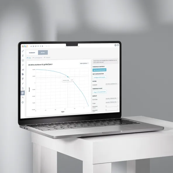
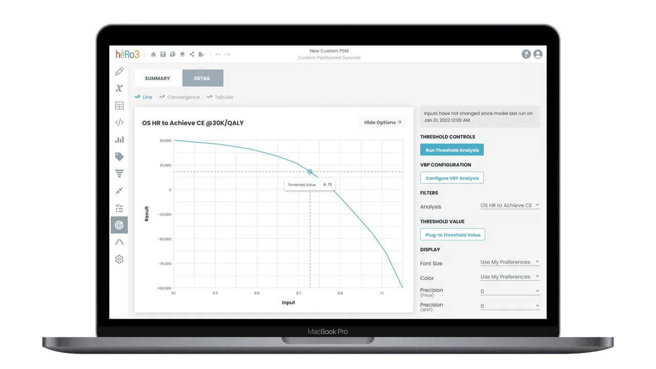 Visualizing the goal: The primary line mockup allowing users to see exactly which variable values produce their target outcome.
2. Execution & Component Architecture
The challenge here was translating dense, heavy math into an intuitive UI. I broke the solution down into two phases: Input and Output.
The Input: To keep users from making syntax errors when building out their threshold parameters, I designed a guided “Formula Creation Stepper.” This broke complex mathematical construction down into digestible, sequential steps.
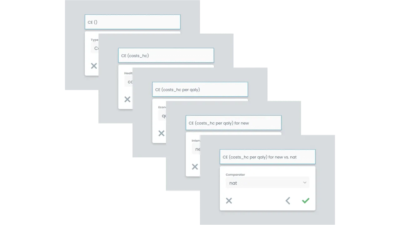 The Formula Stepper: Guiding analysts through complex formula creation without overwhelming them with raw syntax inputs.
The Output: Standard bar charts wouldn’t work for this level of data. I worked with the engineering team to design bespoke data visualizations specifically tailored for threshold analysis.
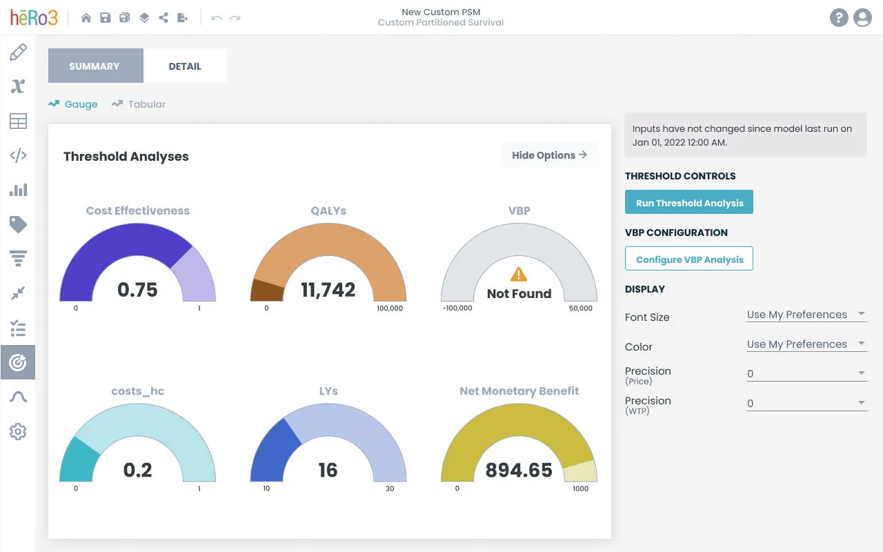 The Summary Gauge: A bespoke UI component designed to give a high-level, instant read on the threshold results.
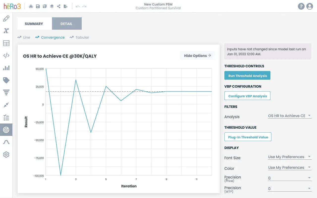 The Details: Convergence graphs allowing analysts to pinpoint the exact mathematical intersection of their datasets.
3. Navigating Constraints
The biggest hurdle was bridging the gap between what the R-models required and what the React frontend could handle gracefully.
Data scientists demanded extreme flexibility in how they built their formulas. Ensuring the Formula Stepper could handle complex, nested logic without breaking the layout or overwhelming the user required heavy prototyping and constant iteration with the engineering team to ensure the UI mapped perfectly to the backend logic.
4. The Impact
- Data Democratization: We turned raw, intimidating R-model outputs into highly visual, interactive tools that even non-technical stakeholders could understand during presentations.
- Reduced Error Rates: The guided formula stepper drastically cut down on calculation failures caused by manual syntax errors.
- Faster Analysis: Economists could identify their critical threshold tipping points in minutes rather than hours.
See More of My Work