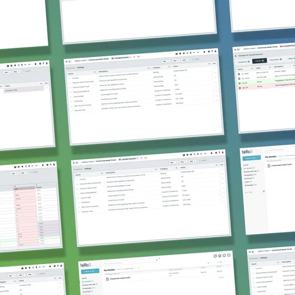
heRo3 Power Tools
Design System & Debugging Tool
Skills Used
Figma | React | R-Models | Design Systems
What started as a simple request to fix some ugly UI colors turned into a massive workflow overhaul. I audited the platform's chaotic "rainbow" of datatypes, consolidated our design system, and pitched a suite of new features. The centerpiece was a bidirectional "Trace" tool that saved analysts hours of digging through complex models to find data errors.
1. The Core Problem: The “Rainbow” UI
As the platform scaled, the sheer volume of datatypes required distinct color-coding to maintain contrast. This resulted in a fragmented visual interface where different libraries used conflicting colors for similar data.
This “rainbow” effect wasn’t just an eyesore—it caused severe accessibility issues and made the platform look unprofessional during enterprise marketing demos. We needed a cleaner way to communicate complex data states.
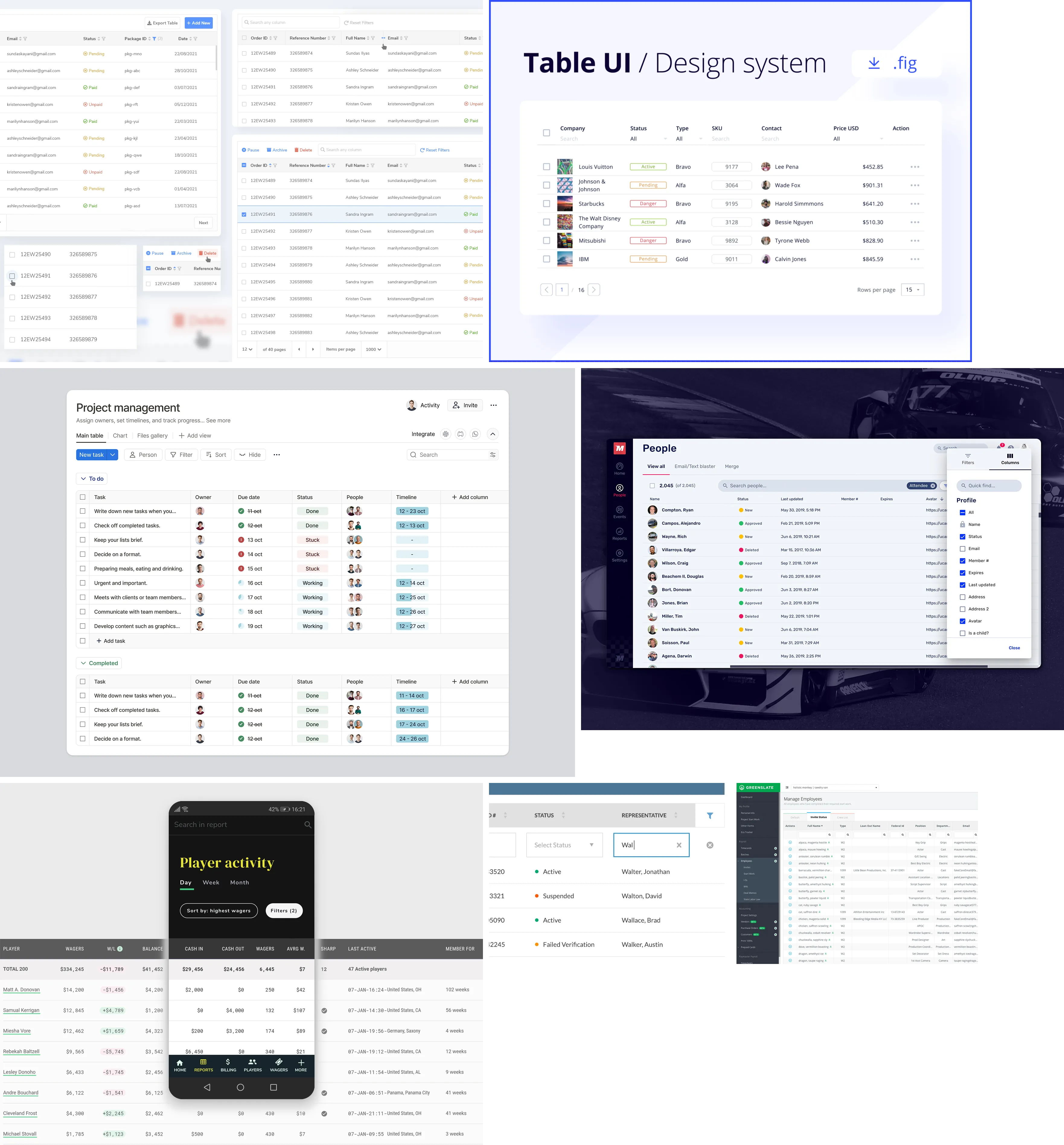 Initial research: Looking into how we could communicate subtle data states without relying on a chaotic mix of brightly colored pills.
2. The Audit & Consolidation
I realized we couldn’t just swap colors; we had to rethink the entire system. I conducted a comprehensive cross-library audit of all datatypes and syntax highlighting to identify structural redundancies.
By mapping this entire ecosystem, I proved to the engineering team that many of our datatypes could be logically combined.
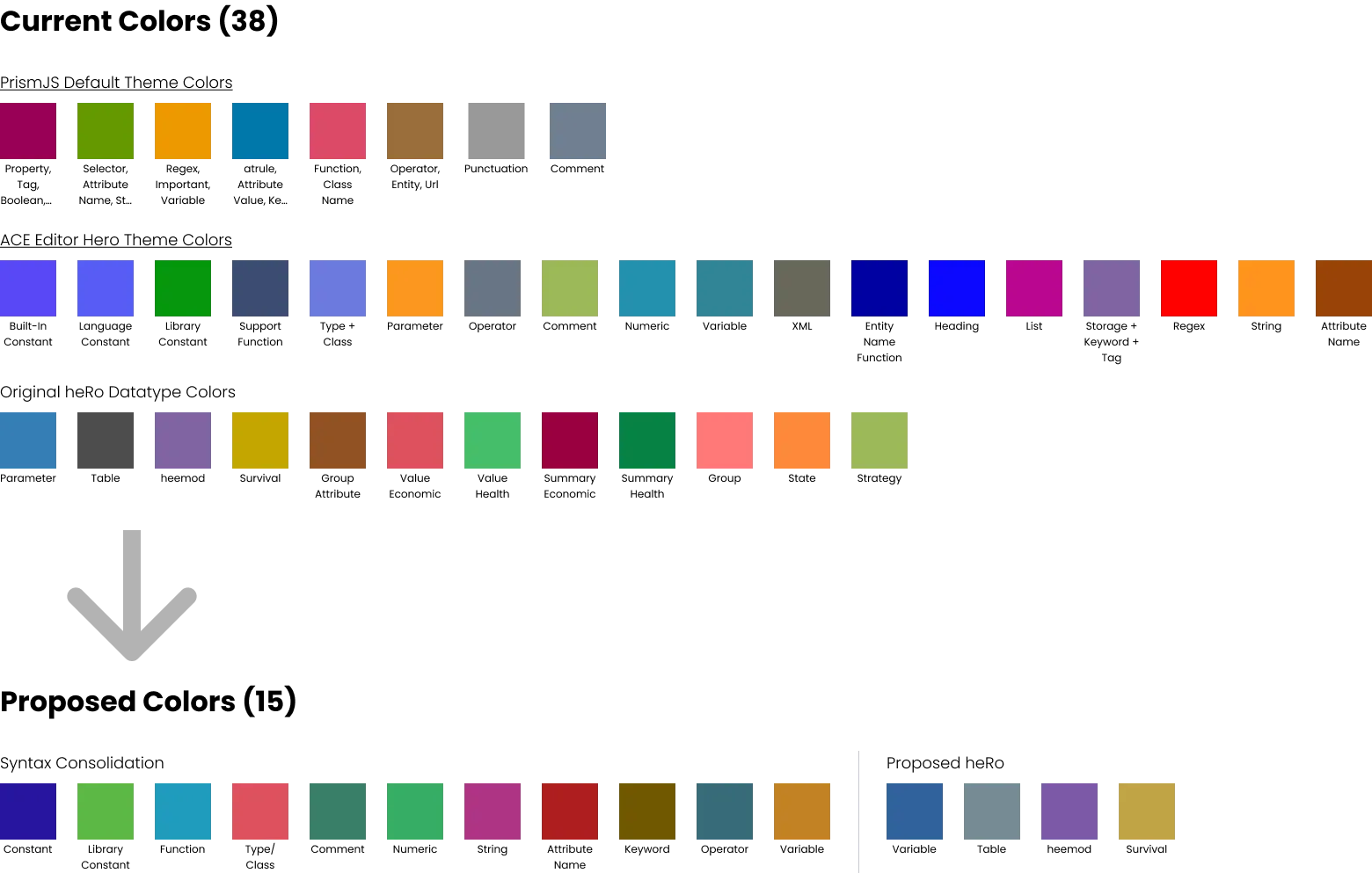 Mapping the ecosystem: I audited every datatype across the platform to identify redundancies and establish a clean, scalable palette.
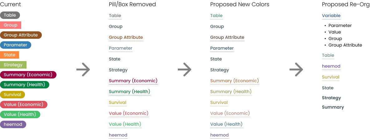 Using visual aids to get stakeholder alignment on how the old datatypes mapped to the new, consolidated system.
3. Pitching UX Debt as a Feature
Initially, executive leadership viewed these UI improvements as low-value maintenance that pulled resources away from building new features.
To overcome this resistance, I expanded the scope slightly. I bundled the color consolidation together with a new object inspector and syntax highlighting, pitching it as a comprehensive “Power Tools” package. Reframing UX debt as a high-value product release secured immediate buy-in.
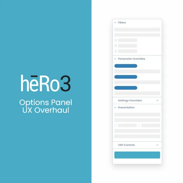
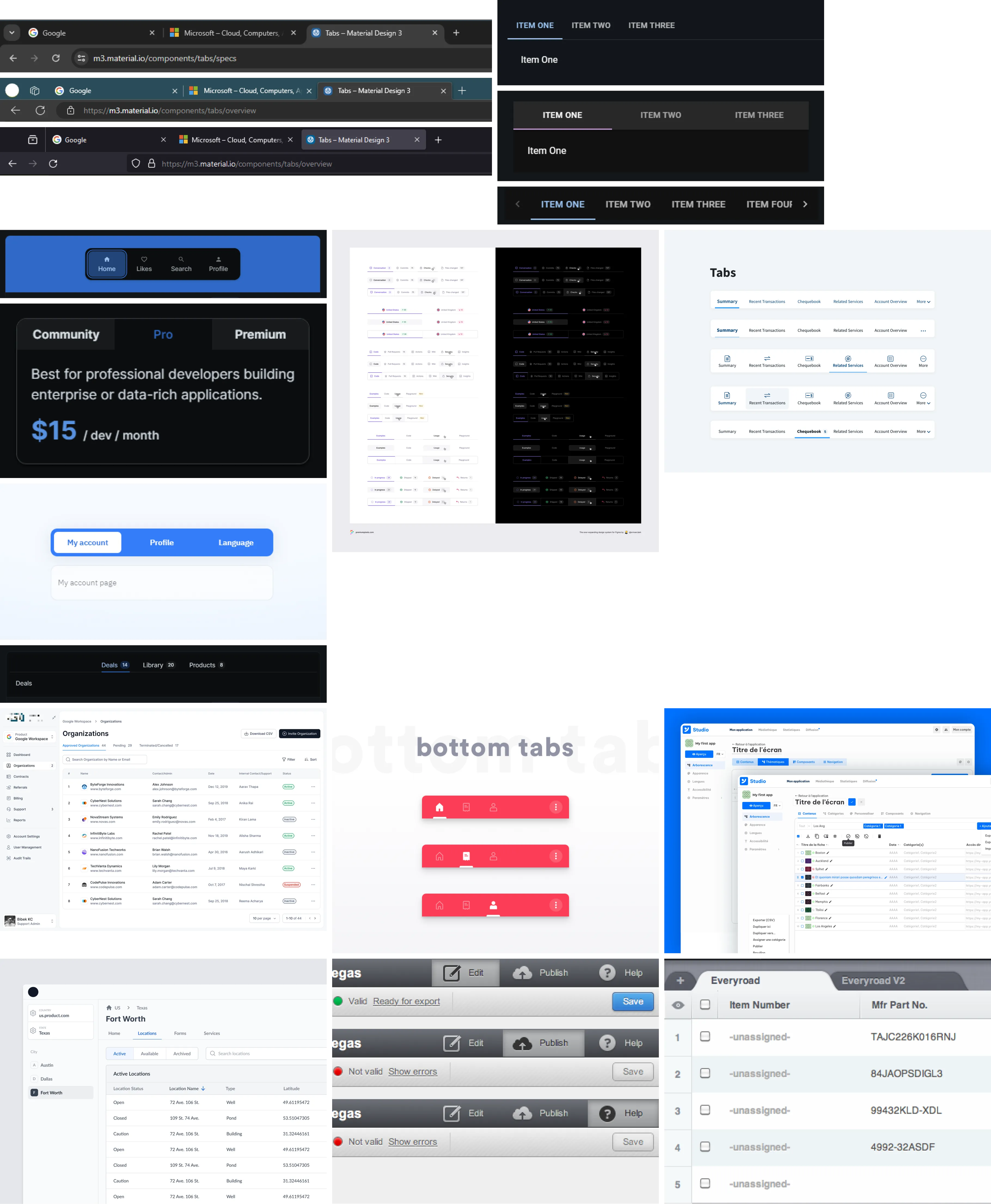 Iterating on new tab structures to elegantly house the expanded object inspector and syntax tools without cluttering the screen.
4. Execution: The Trace Tool
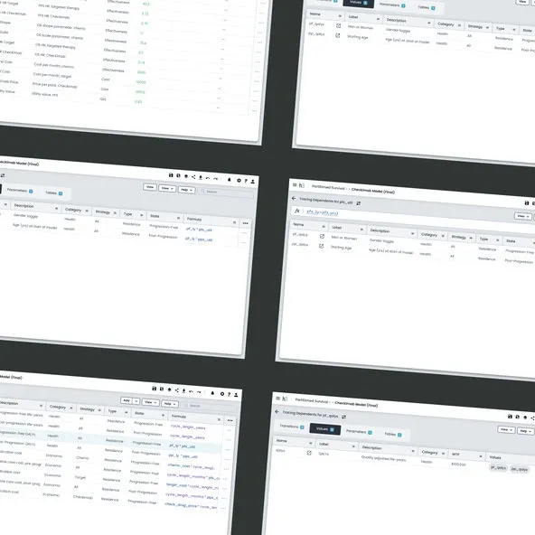
During this overhaul, I identified a massive workflow gap: users were wasting hours trying to find where conflicting variables were occurring inside massive data sets. It was like looking for a needle in a haystack.
To solve this, I designed a bidirectional “Trace” feature as the crown jewel of the Power Tools update.
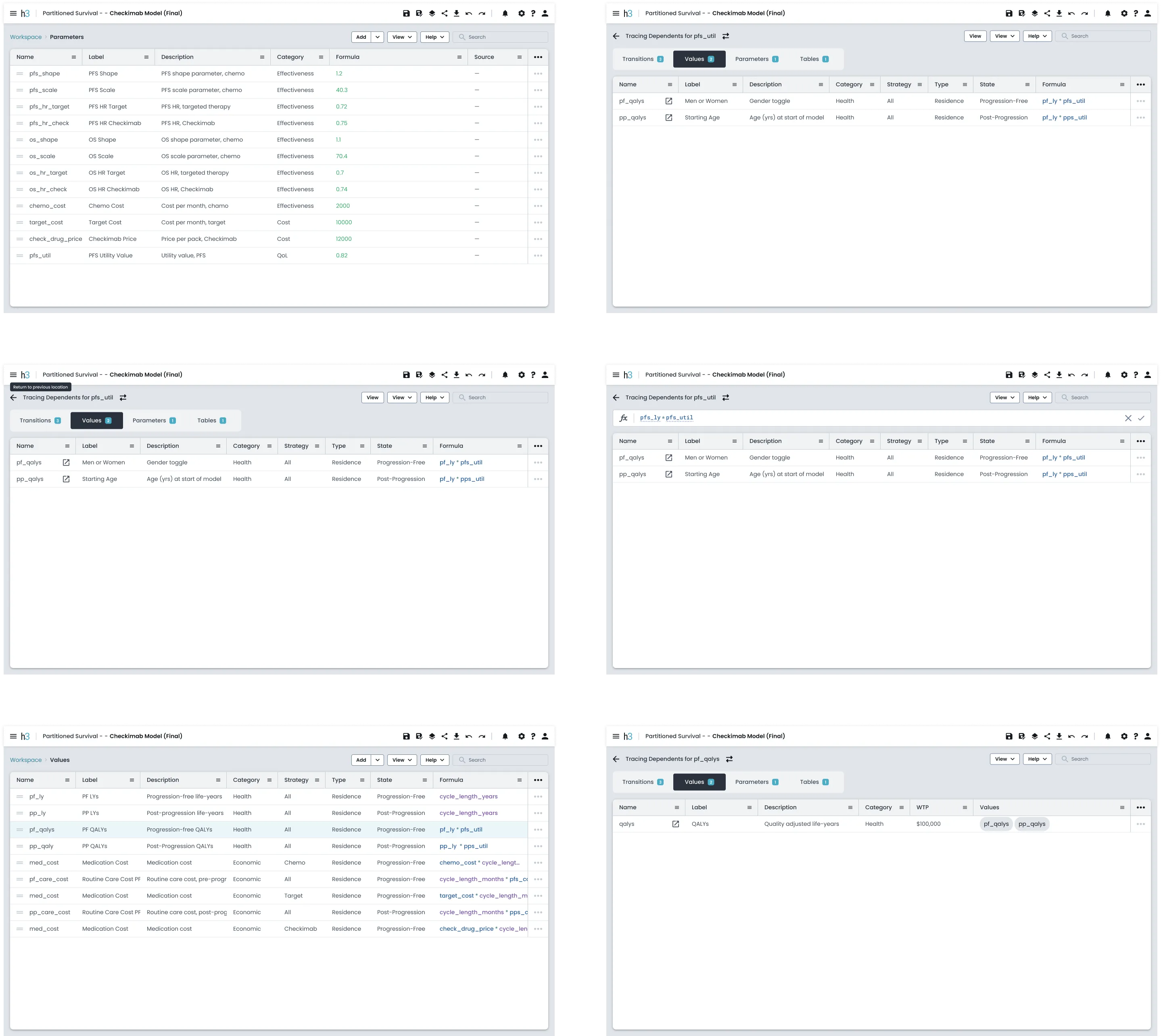 The Trace flow: A bidirectional tool that let users instantly map variable dependents (down the chain) and precedents (up the chain).
5. The Outcome
By bundling these updates together, we completely transformed the platform’s usability.
- Enterprise Credibility: We replaced a messy, inconsistent UI with a highly accessible, brand-aligned system that looked great in live demos.
- Debugging Velocity: The Trace feature fundamentally changed the user workflow. Eliminating hours of manual searching for data errors became one of the most highly praised updates by our active users.
- Design Influence: We proved that taking the time to fix underlying UX architecture (instead of just patching UI symptoms) drives serious business value.
See More of My Work