heRo3 UX Options
Information Architecture Overhaul
Skills Used
Adobe XD | UX Research | Information Architecture | Enterprise UI
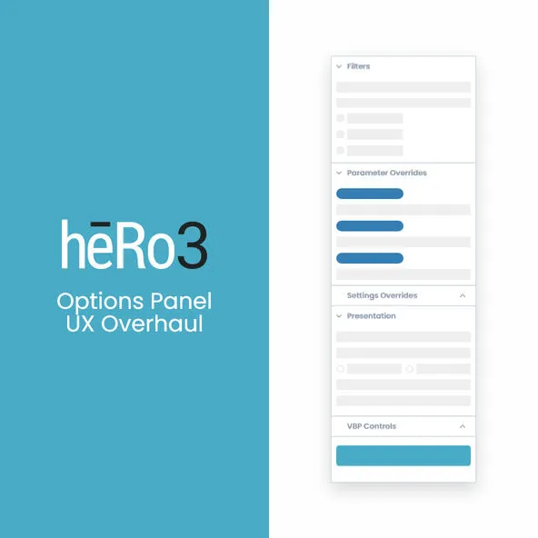
The platform had outgrown its original Material Design components, making the main Options Panel too tall and burying critical features. I bypassed flawed passive analytics and used direct user surveys to redesign the information architecture. By introducing contextual rendering and a sticky action bar, we rescued buried functionality and made the dense UI actually usable.
1. The Core Problem: Outgrowing Material Design
When heRo3 initially launched, the out-of-the-box Material Design components provided a clean, airy interface. But as the product matured and custom controls were added, Material Design’s tall vertical spacing became a massive liability.
Critical functionality was pushed below the fold, forcing users to endlessly scroll and causing them to miss key features entirely. We needed to drastically increase our data density.
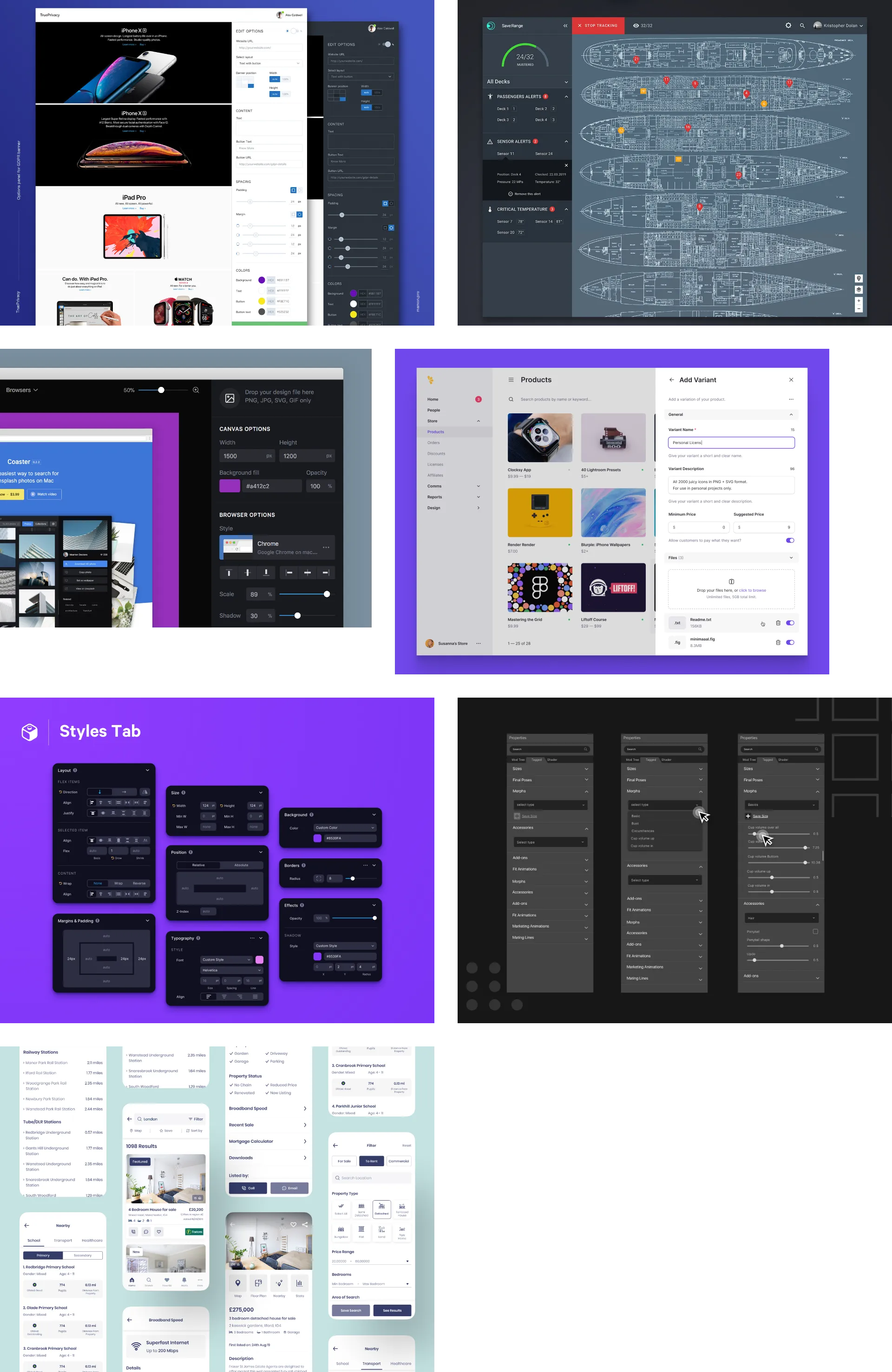 Initial research: Looking at how other complex enterprise platforms handle deep hierarchical data without overwhelming the user.
2. Research & IA Overhaul
To determine a new visual and informational hierarchy, I needed reliable data. I identified reliability issues with our existing passive analytics and heatmaps, so instead of trusting flawed data, I ran targeted, direct user surveys.
I synthesized these findings into a new Information Architecture map, color-coded by actual user usage data. This provided the concrete justification I needed to pitch leadership on reprioritizing high-value controls to the top of the panel.
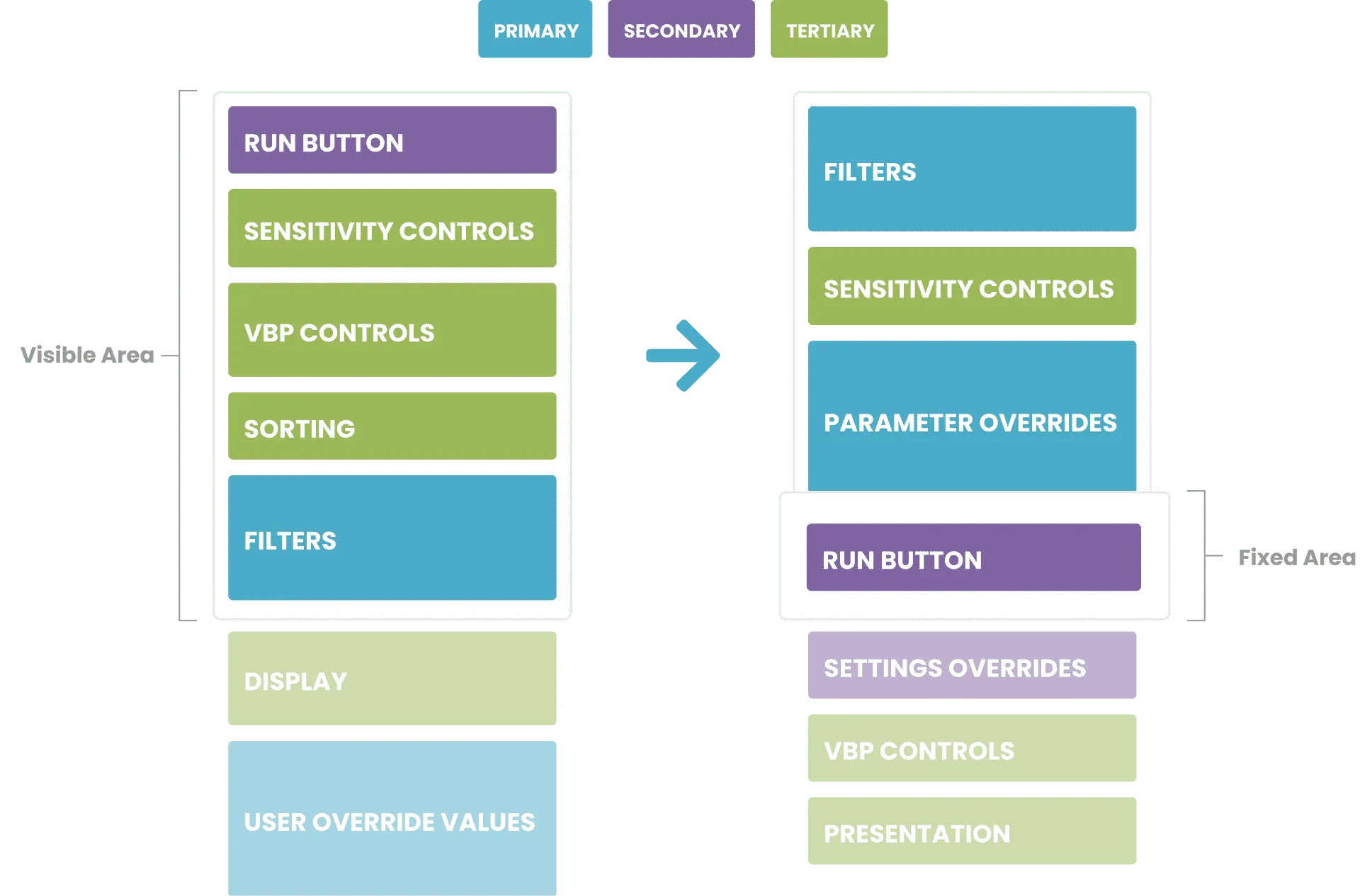 Visualizing the problem: Mapping out the IA to show exactly how much high-value functionality was sitting below the average user’s browser fold.
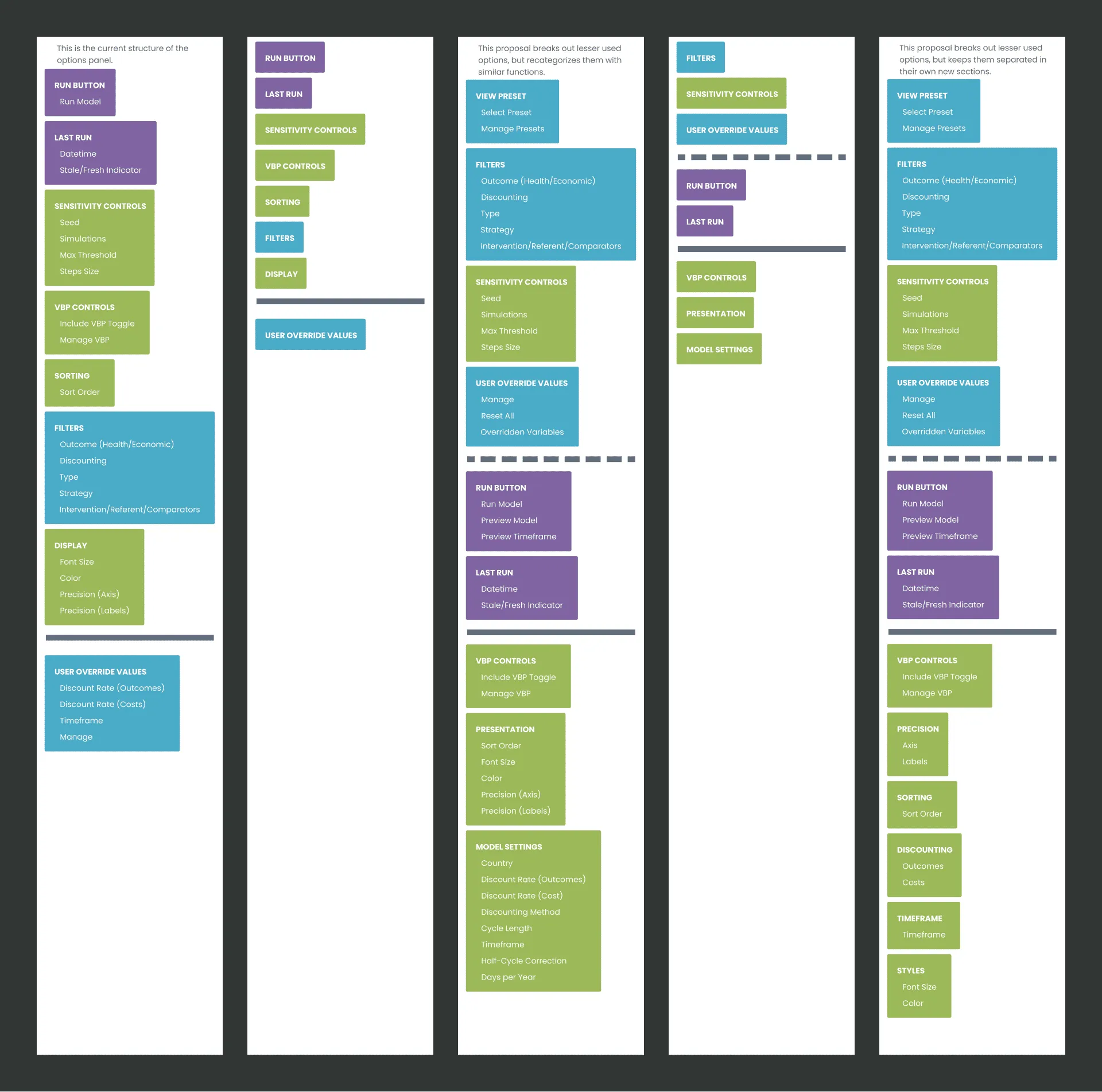 Expanding the IA into structural layout proposals to test different grouping and layout strategies.
3. The Execution: Contextual UI & Density
To fix the vertical scrolling issue, I tackled the components themselves. I redesigned the default form fields to be much more compact, stripping away the excess padding of standard Material Design.
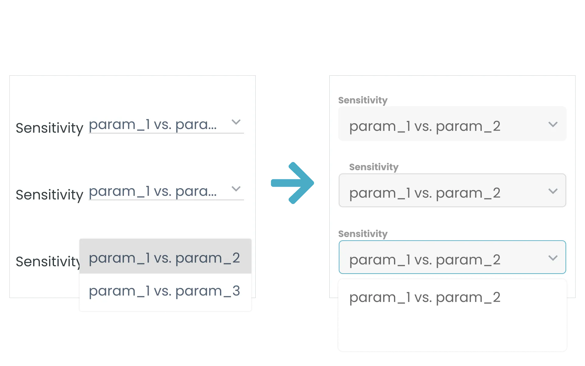 Increasing density: Redesigning the default Material Design form fields to recapture lost vertical real estate.
We also explored progressive disclosure strategies, allowing massive data sections to collapse dynamically so users only saw the controls relevant to their current workflow.
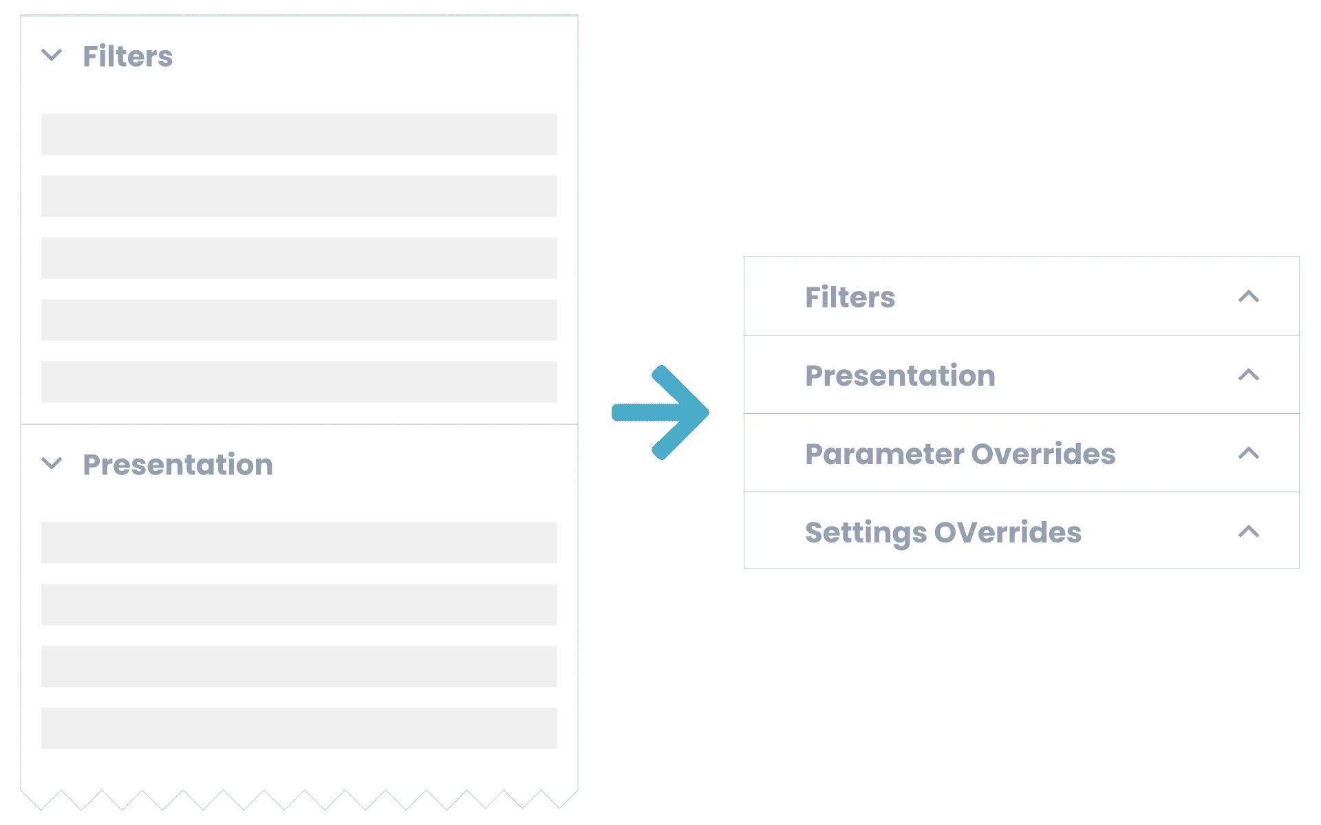 Exploring collapsible sections to improve baseline navigation and reduce cognitive load.
4. Navigating Constraints & Delivery
During the design phase, we explored a high-lift “draggable dashboard” concept to let users build their own custom panels. However, the engineering cost was too high.
I pivoted to an elegant, technically feasible solution: contextual rendering (where fields dynamically float to the top only when relevant) and a sticky global action bar. By anchoring the primary “Run” button to the bottom of the viewport, the most critical action was never buried, regardless of how deep the user scrolled.
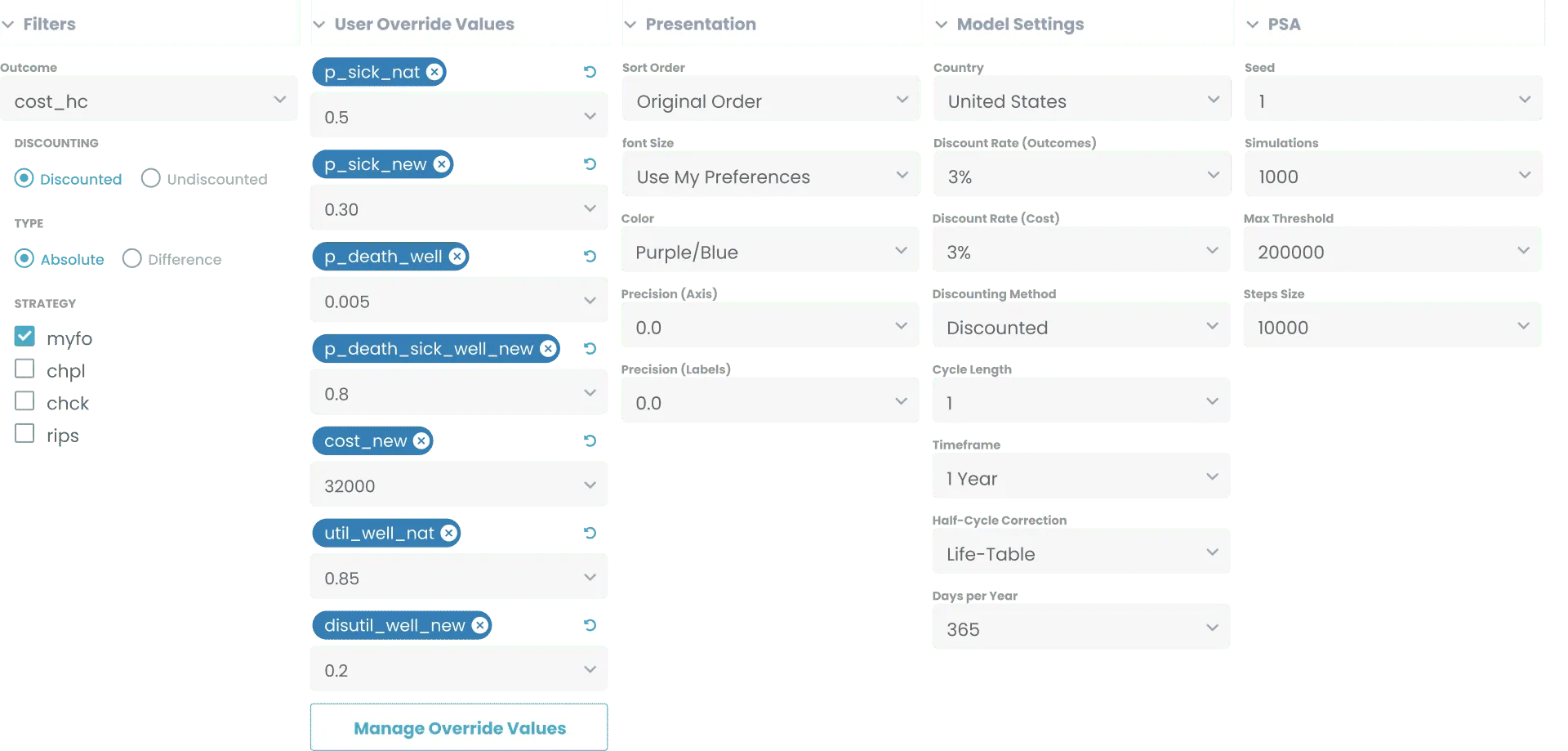 High-fidelity components built in Adobe XD to prove out the scalability of the new dense panel architecture.
See More of My Work