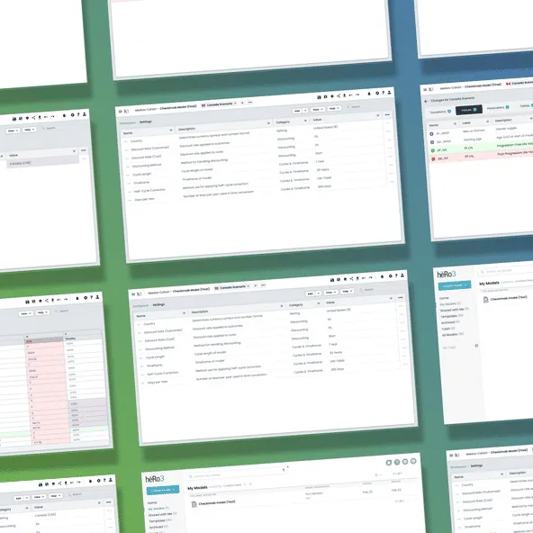
heRo3 Saved Scenarios
State management and versioning UI.
Skills Used
Figma | React | Custom Design System | Jira | Confluence
Health economists were wasting hours manually duplicating massive data models just to compare different outcomes. I designed "Saved Scenarios," a versioning system that let them branch, save, and compare model states instantly. It eliminated manual data entry, slashed error rates, and fundamentally changed how analysts use the platform.
1. The Core Problem: The Friction of Manual Duplication
In health economics, finding the right answer rarely happens on the first run. Analysts have to tweak variables, run models, and compare the outcomes against previous iterations.
Before this feature, the platform lacked a native way to save distinct “states” of a model. To compare two different data sets, users were forced to manually duplicate the entire model, rename it, and adjust the variables by hand. It wasn’t just a massive time sink—it introduced a huge risk of human error that could corrupt the data entirely.
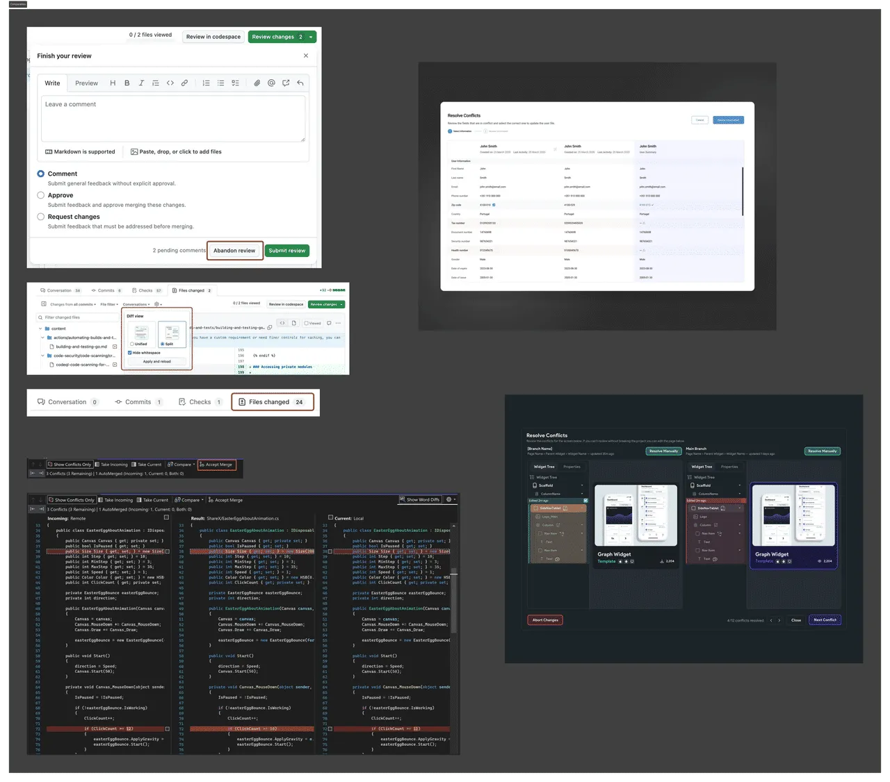 Initial research: Looking at how other version control systems visually communicate additions, subtractions, and merged differences.
2. Execution & Component Architecture
As the sole designer on this initiative, I treated this as an exercise in deep interaction design and system architecture, not just a UI update.
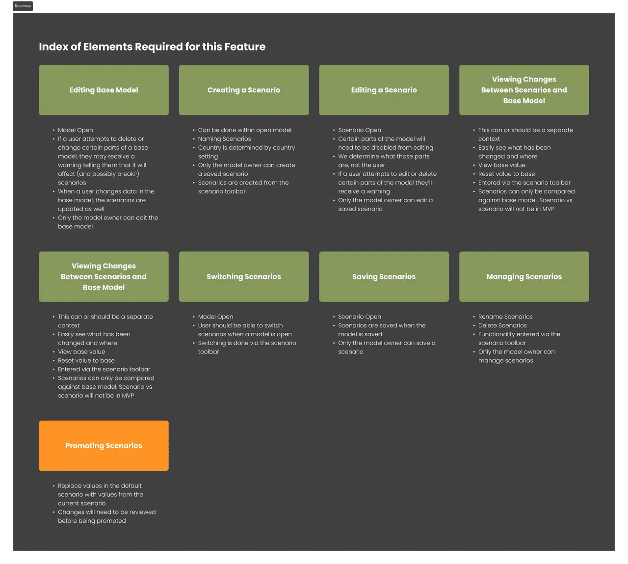 Mapping it out: Creating a clear roadmap early on to guide design tasks and estimate the engineering scope.
- Decoupling the Data: I worked closely with the engineering team to figure out exactly how the underlying React architecture and R-models handled state. Understanding the backend let me design a UI that respected technical constraints without exposing the user to messy database logic.
- Contextual UI: To avoid cluttering the main workspace, I designed a contextual drawer system. Users could open the scenarios panel, save their current state, or jump back to a historical state without losing their place in the active workflow.
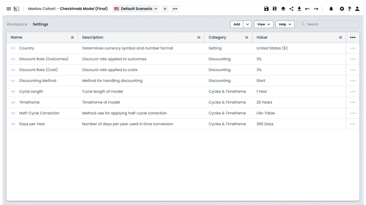 The contextual drawer system, allowing users to manage states without leaving their primary workspace.
- Diffing & Comparison: I built a visual comparison tool that allowed users to stack two saved scenarios side-by-side.
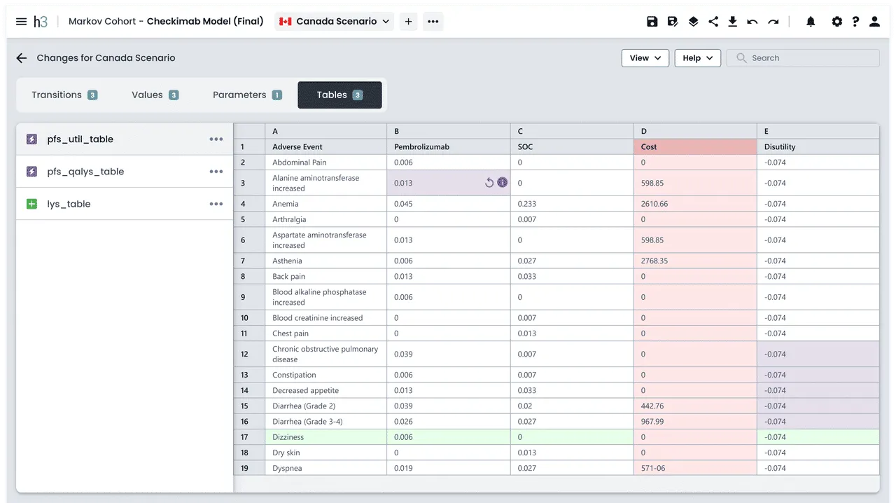 The diffing tool in action: Using targeted color-coding and clear typography to instantly highlight differing variables, eliminating the need to “stare-and-compare.”
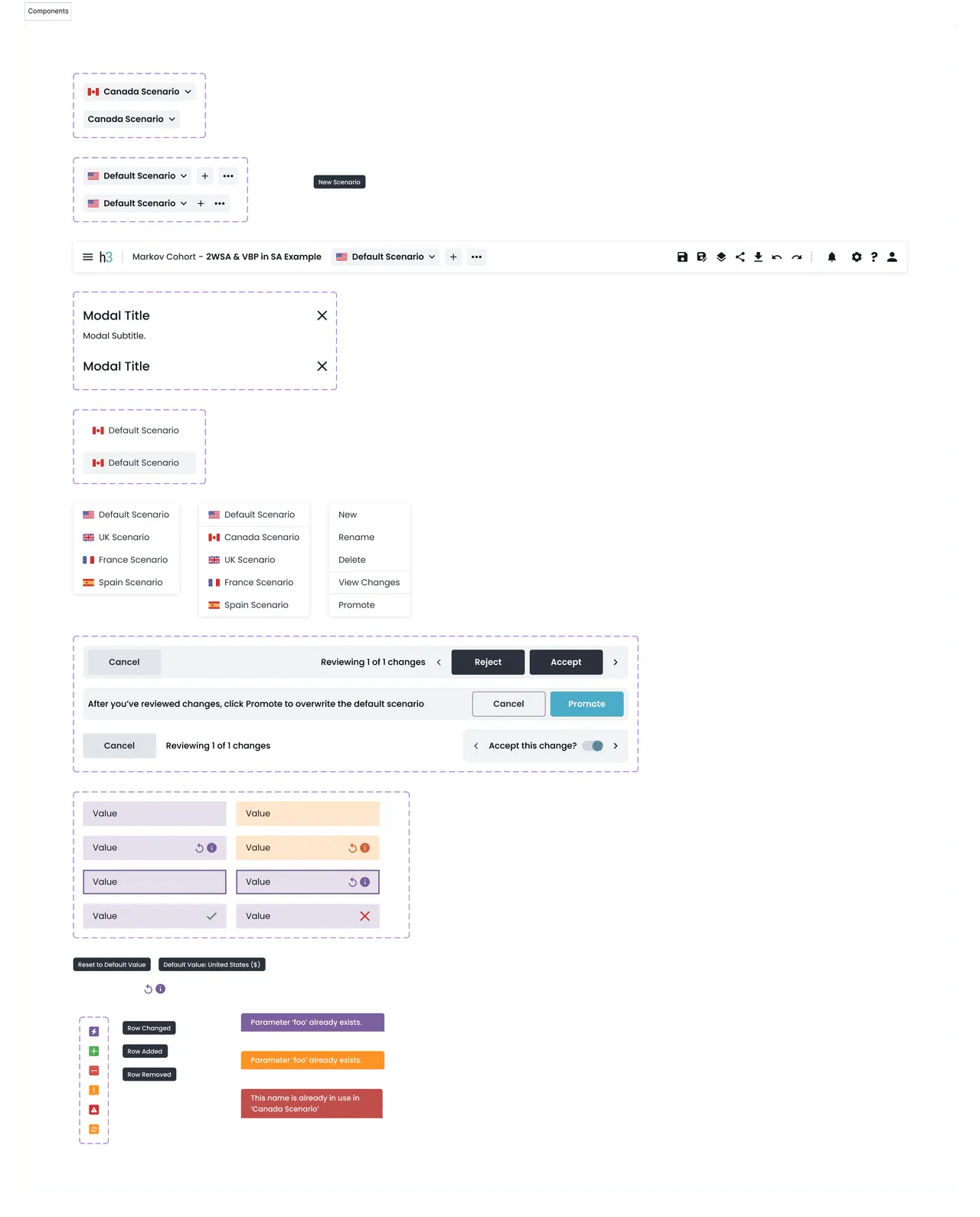 Component Architecture: Building out the atomic and molecular components in Figma to ensure a seamless handoff to the React team.
3. Navigating Constraints
Because this feature required manipulating core database states, the engineering lift was incredibly high. Early on, we realized that building a fully automated “merge” feature for different scenarios was totally out of scope.
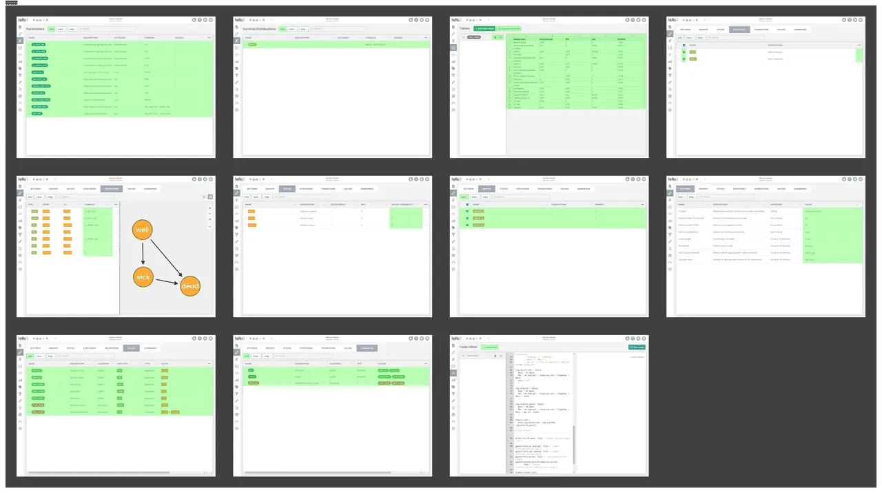 Identifying all impacted editable areas of the app to plan for complex edge cases before writing any code.
Instead of fighting for an unrealistic technical feature, I pivoted the interaction design. I built a robust, read-only comparison view paired with a single-click “Restore to this Scenario” action. This solved the user’s primary need—auditing and rolling back data—while keeping the engineering scope manageable so we could actually ship on time.
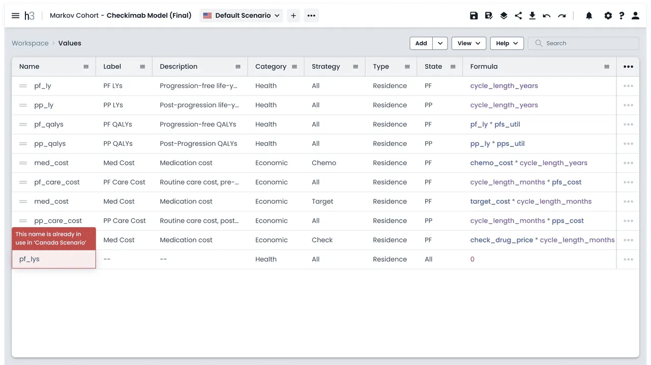 Handling complex validation states gracefully to prevent users from saving broken models.
4. The Impact
- Workflow Velocity: We completely eliminated the need for manual model duplication, saving analysts hours of tedious data entry every week.
- Data Integrity: Dramatically reduced user-reported errors caused by manual variable adjustments.
- Platform Maturity: Set a new standard for complex interaction design within the app, proving that we could handle advanced state management with clean, component-driven UI.
See More of My Work